📈 Visualizations
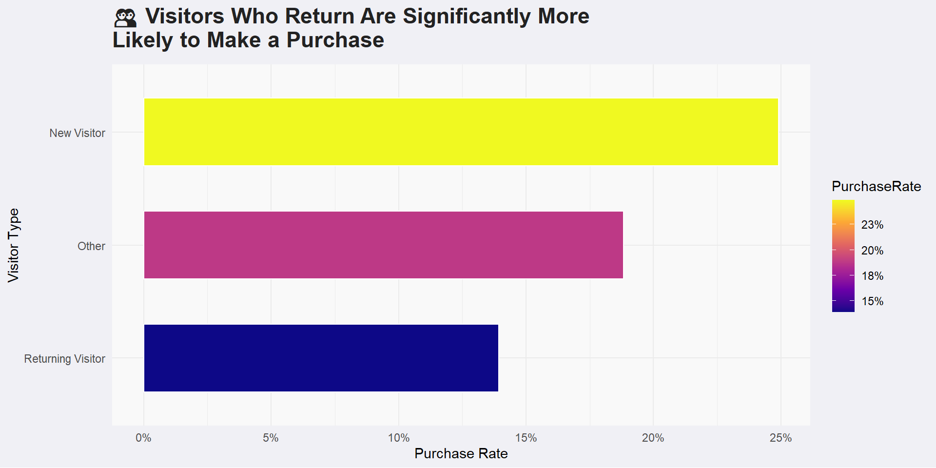
1 Bar Chart
Note
This chart reveals that returning visitors are significantly more likely to make a purchase compared to new visitors or those categorized as “Other.” It suggests that people who come back to the website are more confident or more interested in buying. Therefore, encouraging users to return through targeted marketing or personalized experiences can help boost overall sales.
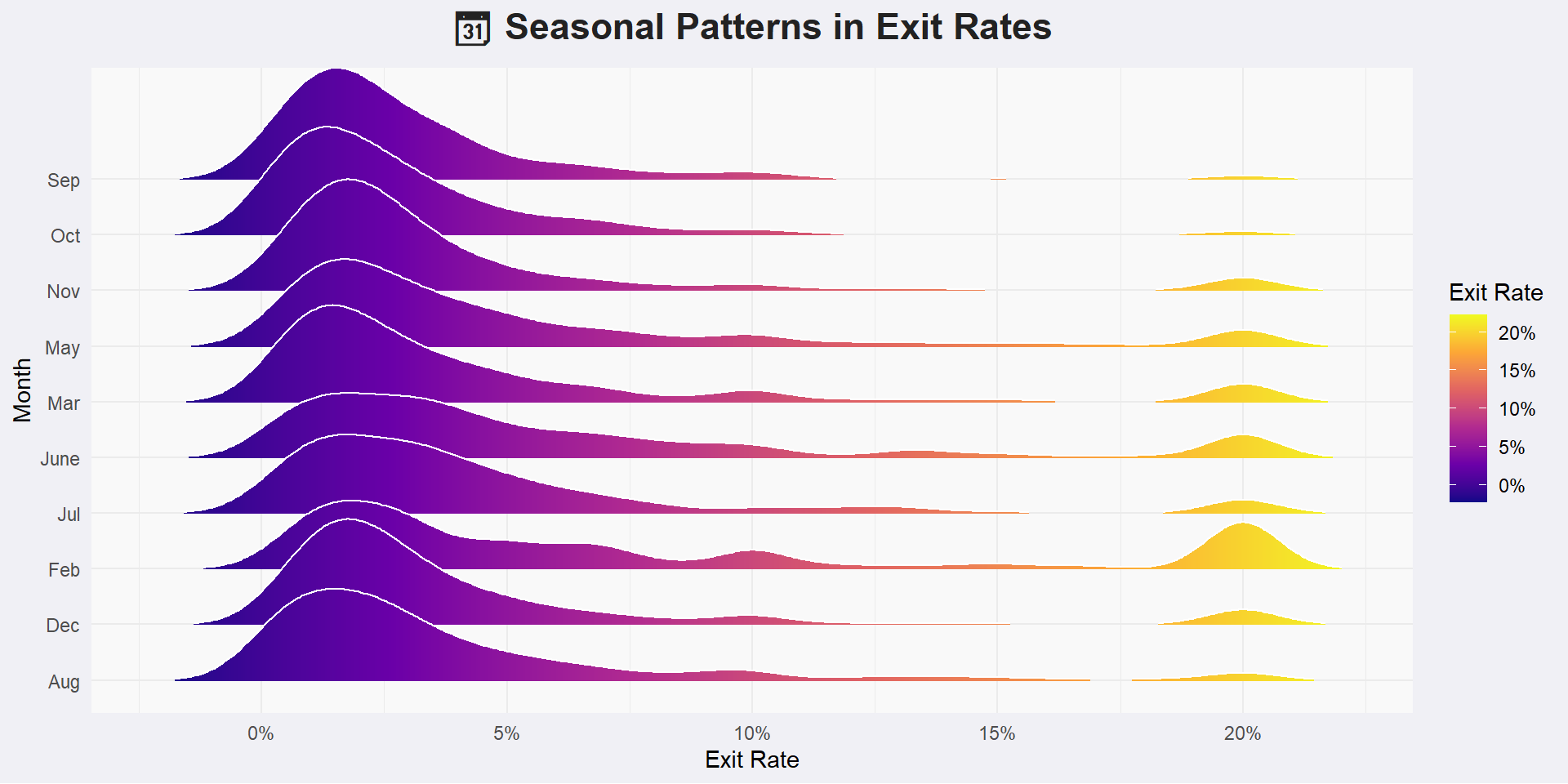
2 Ridgeline Plot
Note
Exit rates vary by month, showing seasonal trends in user behavior. Some months have more people leaving quickly, while others see users staying longer. Brighter colors and wider ridges highlight higher exit activity. This suggests that certain times of year may need better engagement strategies.
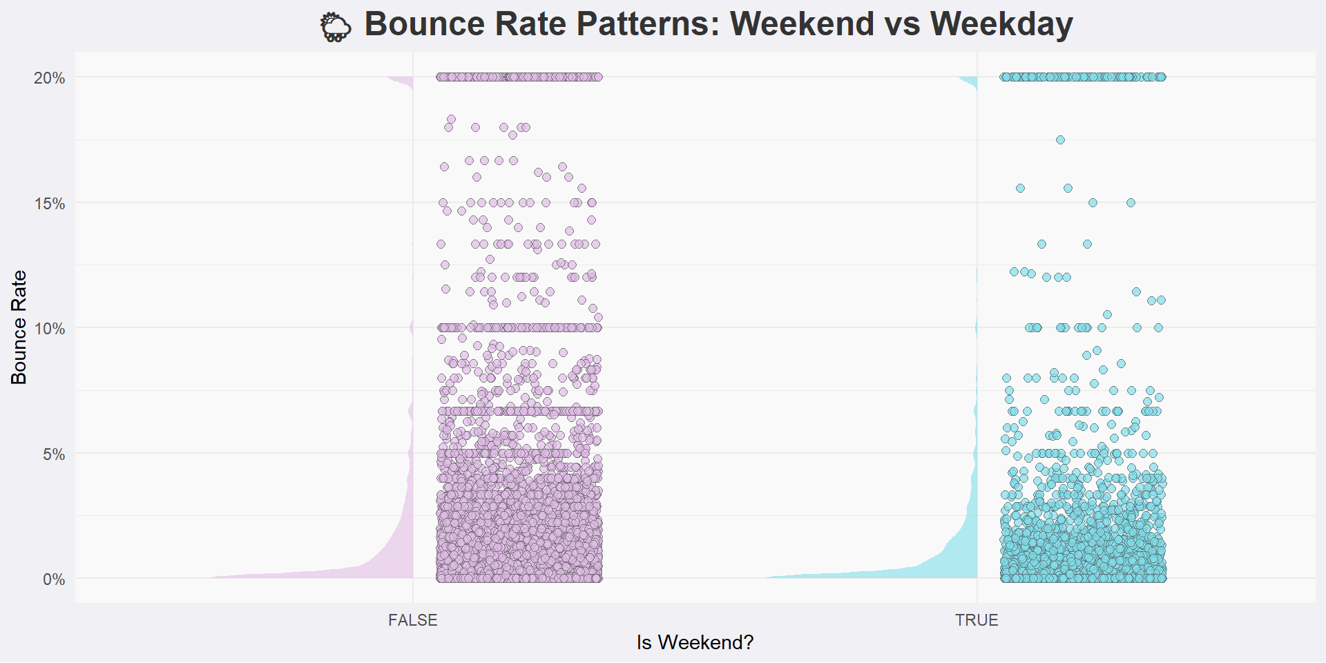
3 Split Violin Plot
Note
This chart shows that bounce rates are usually higher and more spread out on weekends. It means people are more likely to leave the website without interacting when visiting on a weekend. On weekdays, bounce rates are lower and more consistent. This suggests that users are more engaged during weekdays.
4 Scatter Plot
Note
This chart shows how much time users spend on product-related and administrative pages. The points are colored by traffic type, helping us see which sources bring more engaged visitors. Some traffic types result in longer visits to both sections,indicating high purchase interest or intent.